Explaining the Contents of the Weekly Report From A-Z
How Can This Report Help me in Trading and Understanding the Market?
Welcome! You are now (hopefully) among many others to subscribe to this newsletter that started with the aim of adding one of the most important pillars in finance to your trading framework, that is sentiment analysis. This publication has the aim to explain everything in the report from A-Z.
AIM OF THE REPORT AND BASIC INFORMATION
Name: The Weekly Market Sentiment Report
Type: A newsletter containing a report that presents visual and interpretable information on different markets such as Forex, cryptocurrencies, stocks, and commodities.
Frequency: 1 report per week, generally published between Friday night and Sunday night for views and insights relating to the upcoming week.
Coverage: Global macro assets.
Number of models/indicators: Variable and increasing.
How to make use of the report? Follow these guidelines to squeeze out the most added-value of what you’re reading:
Understanding the smart money through COT report values and technical charts. These charts show key reactionary levels using a healthy mix between COT reports and harmonic patterns.
Understanding what options are saying on the stock market. By using information from the put-call ratio, it is possible to find interesting signals on the US stock market.
Understanding the value of the percentages of constituents. By knowing the percentage of stocks that are above or below a certain moving average, we can have an idea of a hidden divergence occurring or even a major structural shift.
Understanding the direction of the economy months in advance. By using a model on the ISM PMI, a known leading indicator, you can expect to have an idea on the overall US economy.
THE COT REPORT STRATEGY
📌 Aim of the section in a nutshell: Deliver timely bullish and bearish signals (in the form of a chart) on different markets (e.g. BTCUSD, Silver, and USDCHF). The time horizon is tactical (a few days-weeks)
The core of the Weekly Market Sentiment Report is the COT strategy. It is composed of the following:
A chart showing the normalized values of the different net positioning.
If there’s an extreme positioning (close to 100 or 0), a mean-reverting stance can be considered.
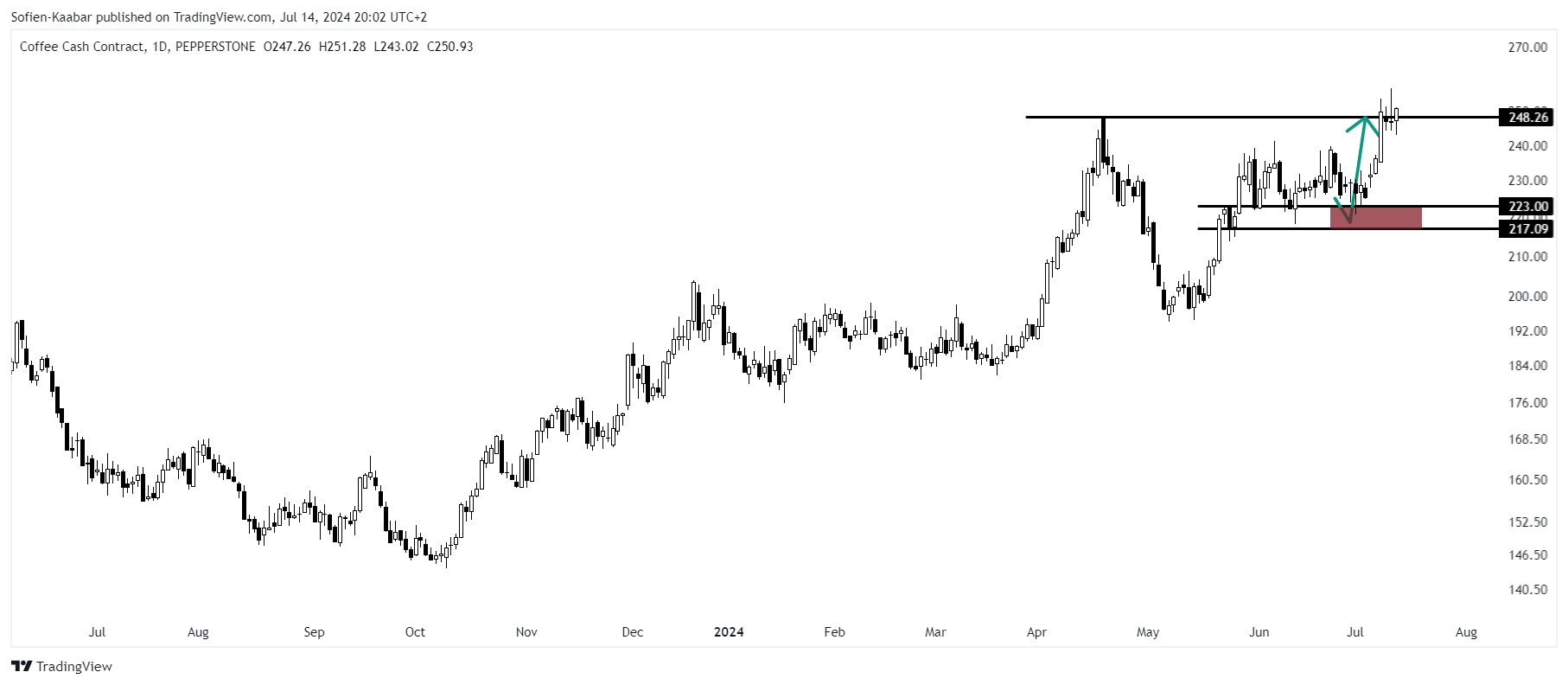
If the technical elements confirm the previous step, a chart will be visible right after with the directional (bullish or bearish) and the levels (reactionary levels and targets).
⚡ This symbol represents a new directional opportunity put forth the moment the report is published.
🔁 This symbol represents an on-going directional opportunity put forth in the previous report(s). It represents an opportunity that was neither stopped out nor reached its target yet.
✅ This symbol represents a recently closed opportunity at a profit. It represents a good forecast.
❌ This symbol represents a recently closed opportunity at a loss. It represents a bad forecast.
The following is an example of a recent chart on Coffee.
Around the end of the report, you can find a section called THE COT REPORT STRATEGY TRACK RECORD; it contains the previous 15 opportunities and their results. The hit ratio is calculated since inception of the document.
PUT-CALL RATIO SENTIMENT INDEX
📌 Aim of the section in a nutshell: Deliver bullish and bearish signals on the S&P 500 with a forecasting horizon of a few days. The time horizon is tactical (a few days-weeks)
Using daily charts and daily PCR values, a strategy is applied with the aim of detecting bullish and bearish signals. The following is the latest chart with the signals the time of writing this explanatory publication.
THE MOVING AVERAGE PERCENTAGE INDEX
📌 Aim of the section in a nutshell: Search for extreme percentages of index constituents that are meeting a certain criteria (e.g. 90% of the S&P 500’s stocks are above their 50-day moving average thus showing a potential stock market correction).
Knowing the percentage of underlying assets within an index that are above or below their moving average helps us understand the hidden strength and weaknesses of the market.
THE RSI PERCENTAGE INDEX
📌 Aim of the section in a nutshell: Search for extreme percentages of index constituents that are meeting a certain criteria (e.g. 84% of the USD crosses have an RSI below 40 thus showing a potential USD bounce).
Knowing the percentage of underlying assets within an index that are showing a certain RSI configuration helps us understand the hidden strengths and weaknesses of the market.
VOLATILITY INDICES
📌 Aim of the section in a nutshell: Present the technical view (in the form of a chart) of the VIX and the EUR VIX in hopes of enhancing the views on the S&P 500 and EURUSD. The time horizon is tactical (a few days-weeks).
Two volatility indicators are discussed in this section. The CBOE Volatility Index (VIX) is a popular measure of the stock market's expectation and sentiment of volatility implied by S&P 500 index options. It tends to rise when investors expect significant near-term volatility in the stock market. Historically, the VIX and the SPX have an inverse relationship. The CBOE EuroCurrency Volatility Index (EUVIX) is a measure of the market's expectations of 30-day volatility of the Euro/U.S. Dollar (EUR/USD) exchange rate. This index is derived from the prices of options on the EUR/USD currency pair and is similar in concept to the VIX (CBOE Volatility Index) which measures the volatility of the S&P 500 index.
THE ISM PMI
The institute for supply management provides a monthly survey called the purchasing manager’s index abbreviated to ISM PMI, which is based on questions asked to 400 representatives of industrial companies about the current and future trend of their different activities. It is composed of 5 components that can also be analyzed individually:
New orders — 30% weight.
Production — 25% weight.
Employment — 20% weight.
Supplier Deliveries — 15% weight.
Inventories — 10% weight.
Typically, we interpret the index as 50 being the neutral state of the economy (neither growing and neither shrinking). A reading above 50 indicates an expansion in manufacturing and a reading below 50 indicates shrinking in manufacturing.
CORRELATION HEATMAP
📌 Aim of the section in a nutshell: Present a full correlation heatmap to understand the current market dynamics and dependencies.
Correlation is a statistical measure that quantifies the relationship between variables. This section is a snapshot of correlation between different markets. It serves as a quick glance to evaluate the possibility of an idea.
For example, EURUSD and USDCHF generally have a negative correlation with both markets roughly representing Europe, but with one having USD as the base currency and the other as the price currency.
Naturally, as EUR and CHF are positively correlated, EURUSD and USDCHF must be negatively correlated. This means that if we see a strong positive correlation between the two pairs, it’s unlikely to have the same directional position on both and expecting them to be profitable at the same time.
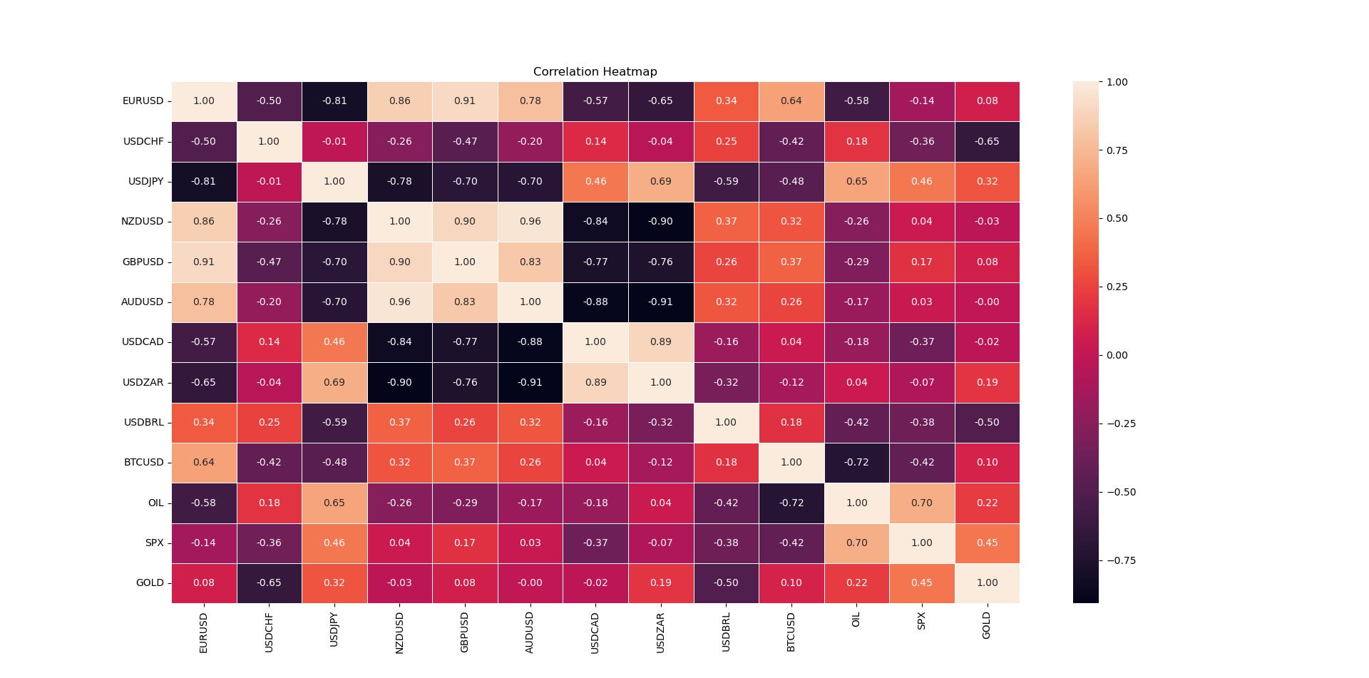
Here’s an example of the weekly correlation heatmap you can expect to see.
You can see that the correlation between EURUSD and USDCHF is -0.50, therefore, they generally move in opposite directions. We can also see that Oil and BTCUSD move in opposite direction with a whopping -0.72 correlation.
A correlation close to -1.00 implies a negative relationship between the two markets (they move in opposite directions), while a correlation close to 1.00 implies a positive relationship between the two markets (they move in the same direction). Finally, a correlation close to zero implies that there is no linear relationship between the two markets (they may or may not move in the same direction).
LAST STOP BEFORE YOU GO
Every information contained in the report is solely for the purpose of showing another angle. Since it is NOT investment advice or trade recommendations, you must NOT use the report as the sole reason for your trading and investing activities.
Trading is fun, enriching, and interesting but not when it comes at the expense of your hard-earned funds. Do not risk what you cannot afford to lose. You must only trade with money you have already considered gone and you must not use trading as your sole revenue generator. Risk management is even more important than the trading strategy itself, make sure to master it.
Data can have many representations and the information presented is but one side of the story which may be incomplete. All back-testing and forward testing results reflect their own time period and not the future as is the case in every research piece.


It's nice you developed this nice strategy, I followed the one course you teach in udemy. Thanks.